Case study
Rebel Dance
| Client | Rebel Dance |
|---|---|
| What we did | Logo design |
| Discipline | Logo design, Branding |
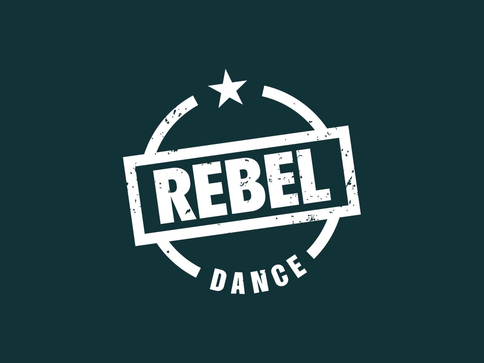
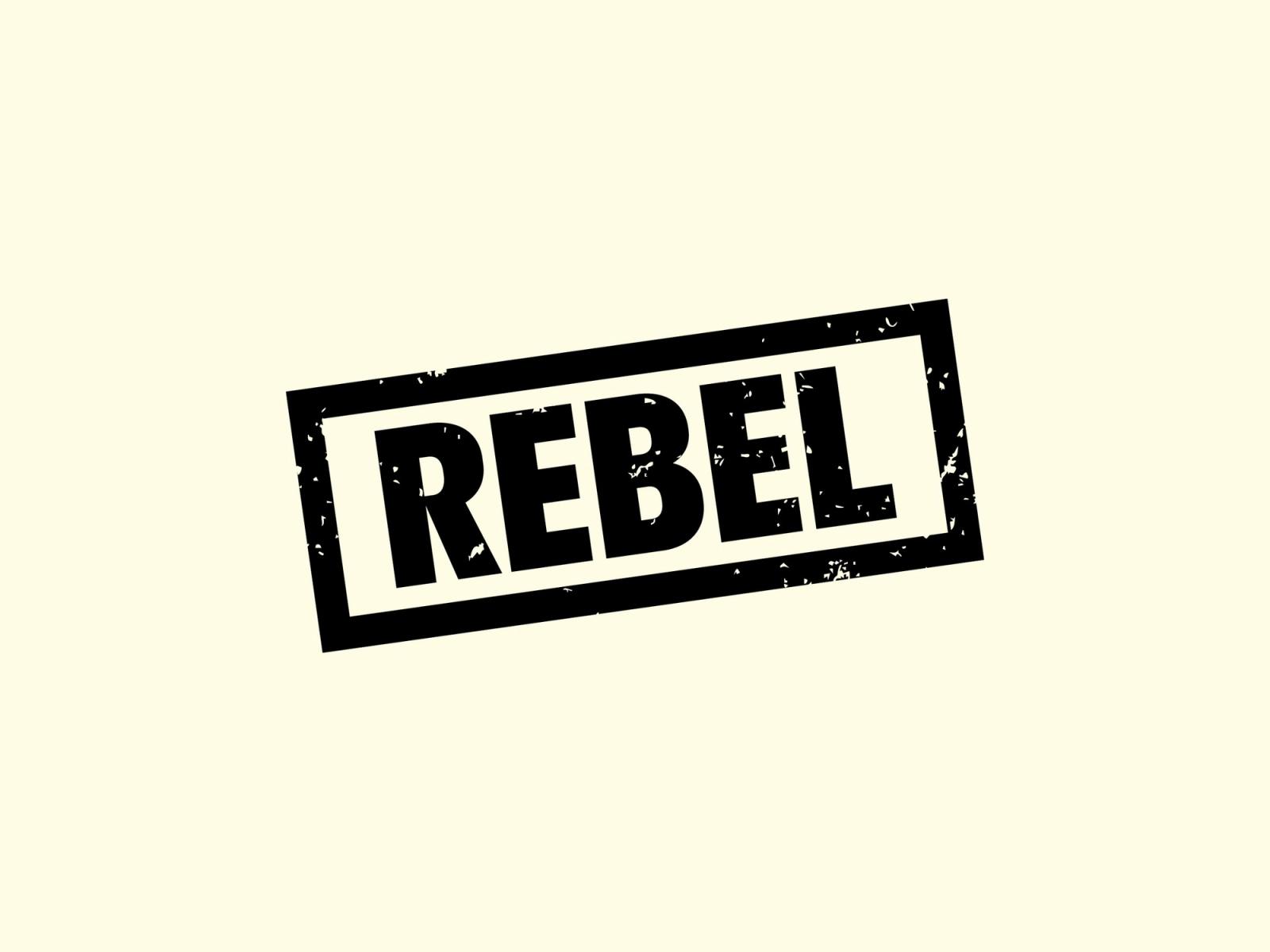
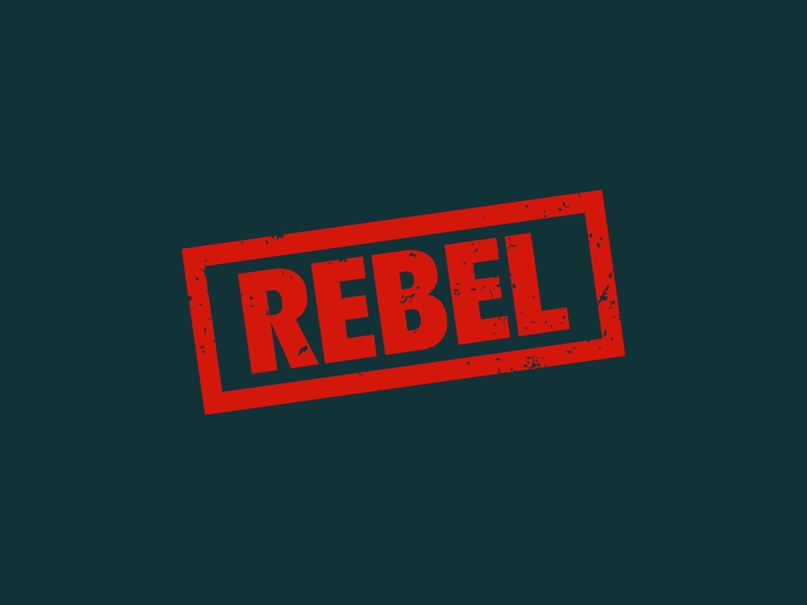
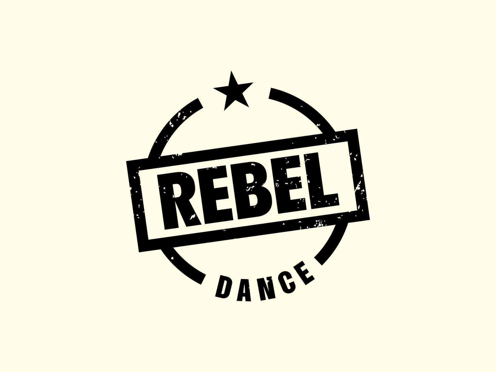
Primary and secondary logos for Rebel Dance, a dance company that runs competitions.
II.
The stamp
Rebel Dance wanted to break away from their old brand with a new name and a new look: impactful, but simple.
We wanted it to feel rebellious, so we looked at the symbols of that culture, from the fail stamp at school to lightning bolts. We showed other routes, and the stamp was their favourite.
The primary logo puts the Rebel stamp inside a broken circle with a star, and the tilted, distressed secondary stamps work in black and red.
More workAll work
The test
How does your brand score?
Two minutes. How your brand earns trust, how your business keeps it, and whether customers and AI can find you.

“The quiz was an eye-opener. It really highlighted the gaps in my business.”