Hafod
| What we did | Product Design, Branding, Logo Design |
|---|---|
| Discipline | Branding |
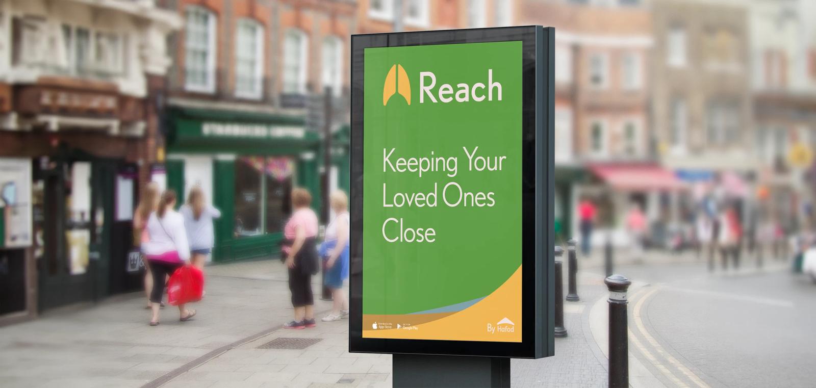
This project was a 24-hour challenge set by Hafod, a not-for-profit organisation dedicated to improving lives by building communities and fostering connections.
We were tasked with creating a product and a corresponding brand that would empower the elderly community, making them feel like more valued and contributing members of society. The aim was to develop an innovative solution that addresses the unique needs and challenges faced by the elderly, enhancing their sense of purpose and inclusion.
About the work
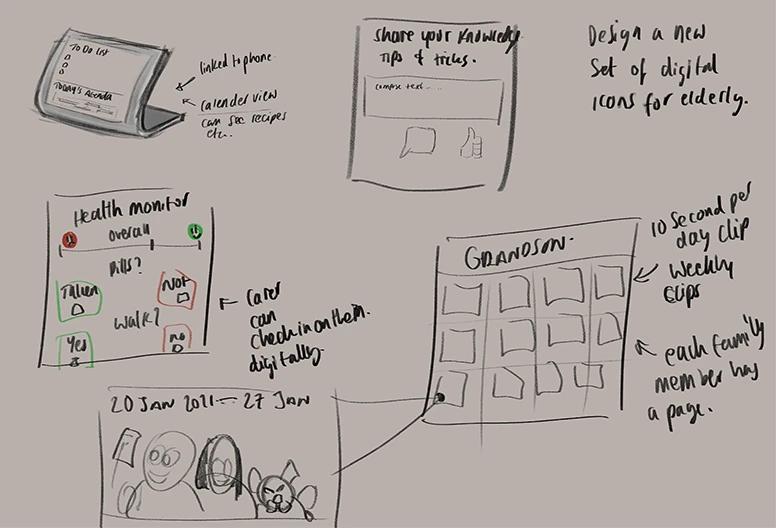
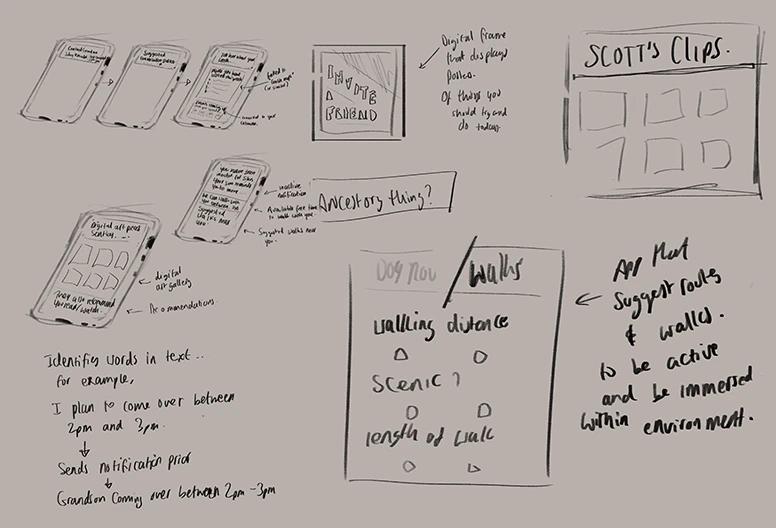
The main idea for the product was to develop an application that fosters intergenerational connections by providing gentle reminders for both youngsters and the elderly to contact each other periodically. The app also includes story updates about grandchildren's lives, which play directly on the elder's device. The design ensured the app was not overly controlling, simply offering a platform for social engagement, such as sending digital birthday cards to family members.
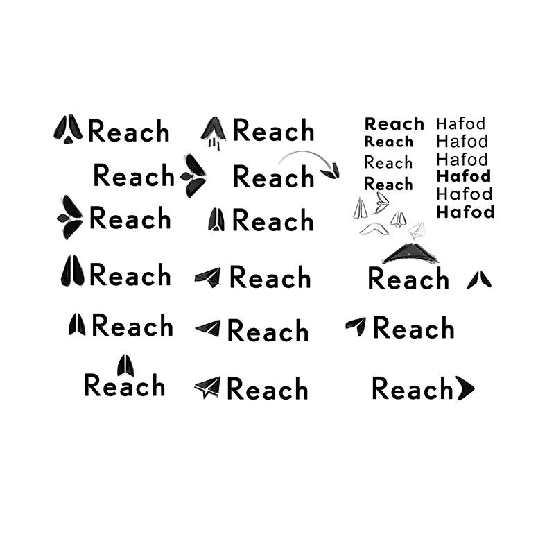
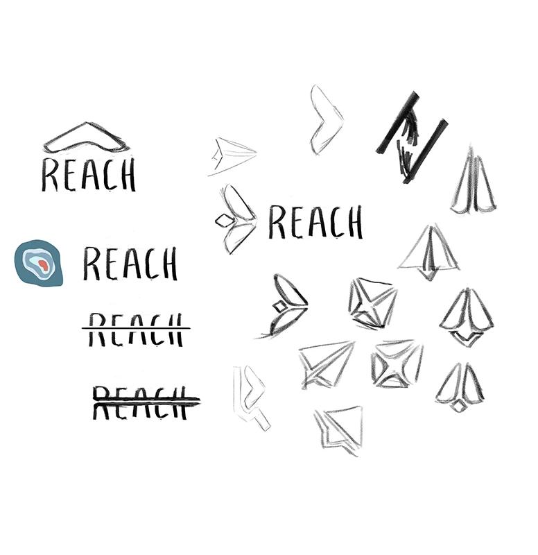
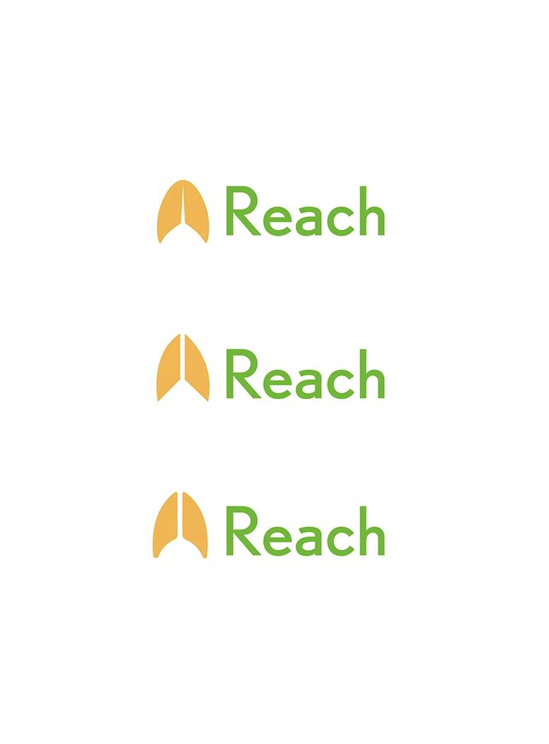
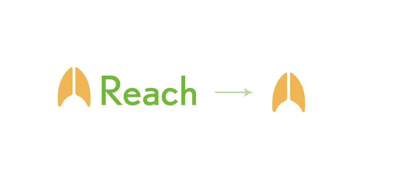
The logo drew inspiration from the Hafod arrowhead/roof and was also influenced by a paper airplane mail icon. This concept resulted in a unique design featuring an upward-pointing arrowhead, symbolising "reaching out" to connect with family members. The logo effectively conveyed the app's purpose of fostering connections and inclusivity within the family.
The colour choices for the project were made with careful consideration and specific reasoning.
Colour & type choices
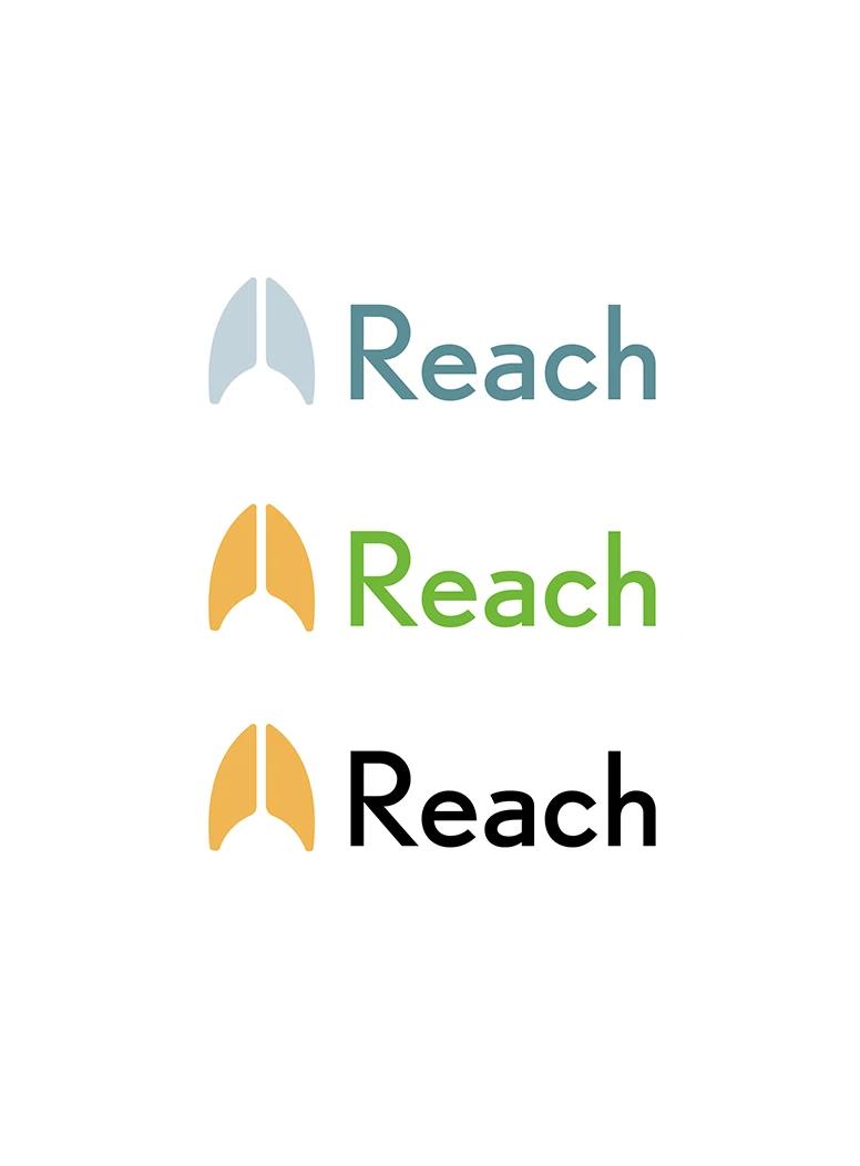
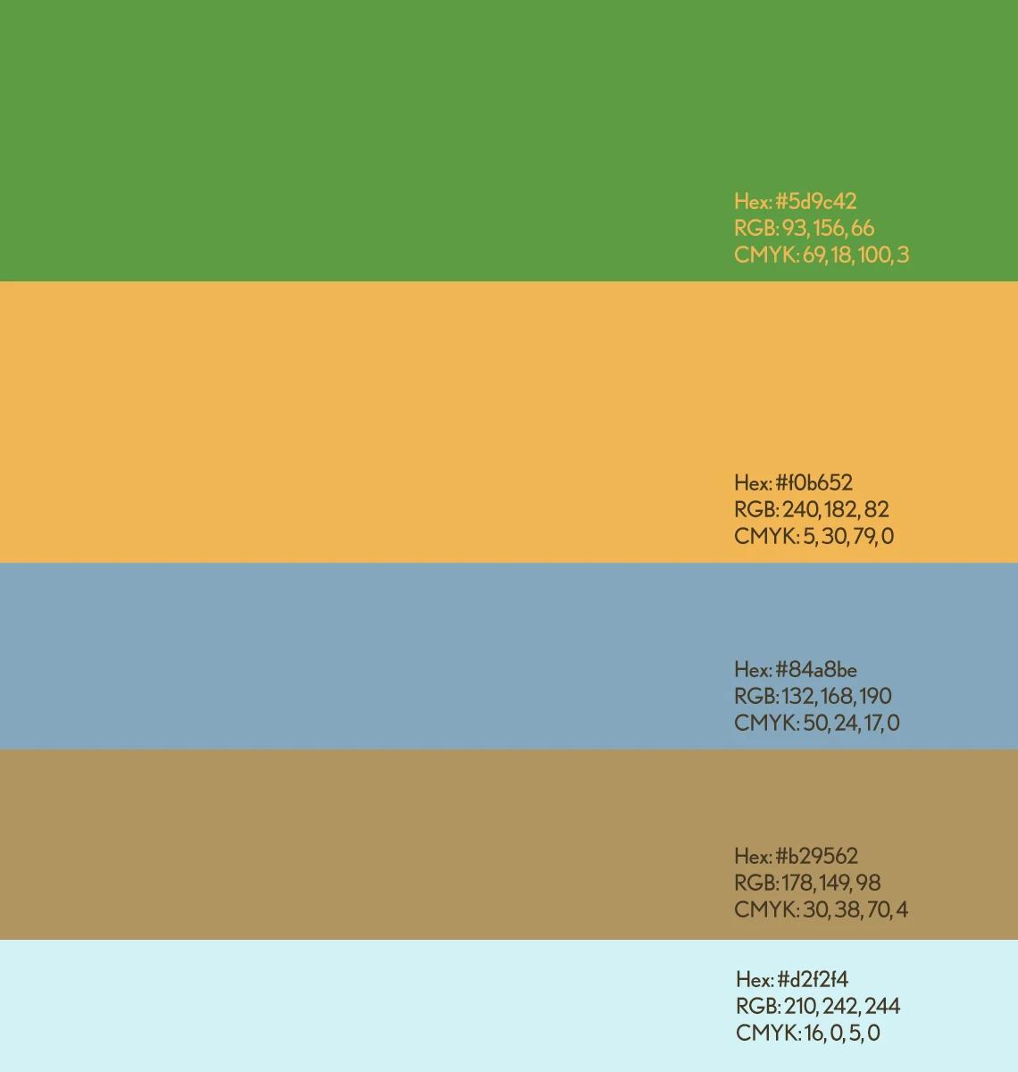
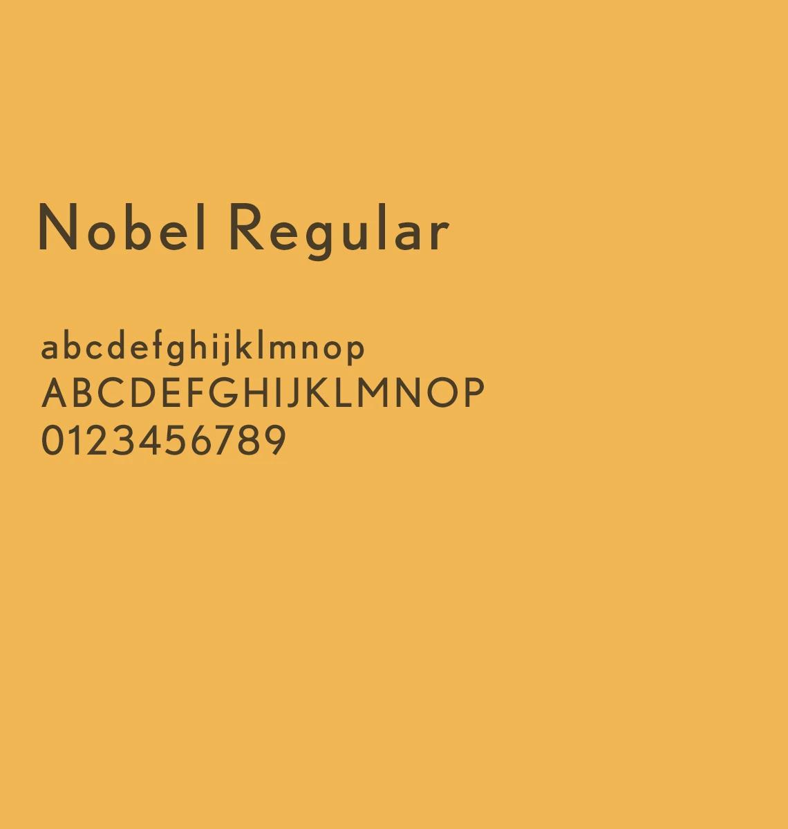
Firstly, they embody the primary colours of Hafod—yellow and green. Secondly, the selection was informed by dementia research, which indicates that colours like blue, red, and green can have beneficial effects, such as providing calm, increasing brain activity, and symbolising growth and life. With this in mind, we utilised various tones of blue and green to form the basis of the colour scheme, ensuring the design was both visually appealing and supportive of the users' well-being.
How does your brand score?
Two minutes. How your brand earns trust, how your business keeps it, and whether customers and AI can find you.

“The quiz was an eye-opener. It really highlighted the gaps in my business.”