Ares Recovery
| What we did | Logo Design, Visual Identity, Marketing Collateral |
|---|---|
| Discipline | Branding |
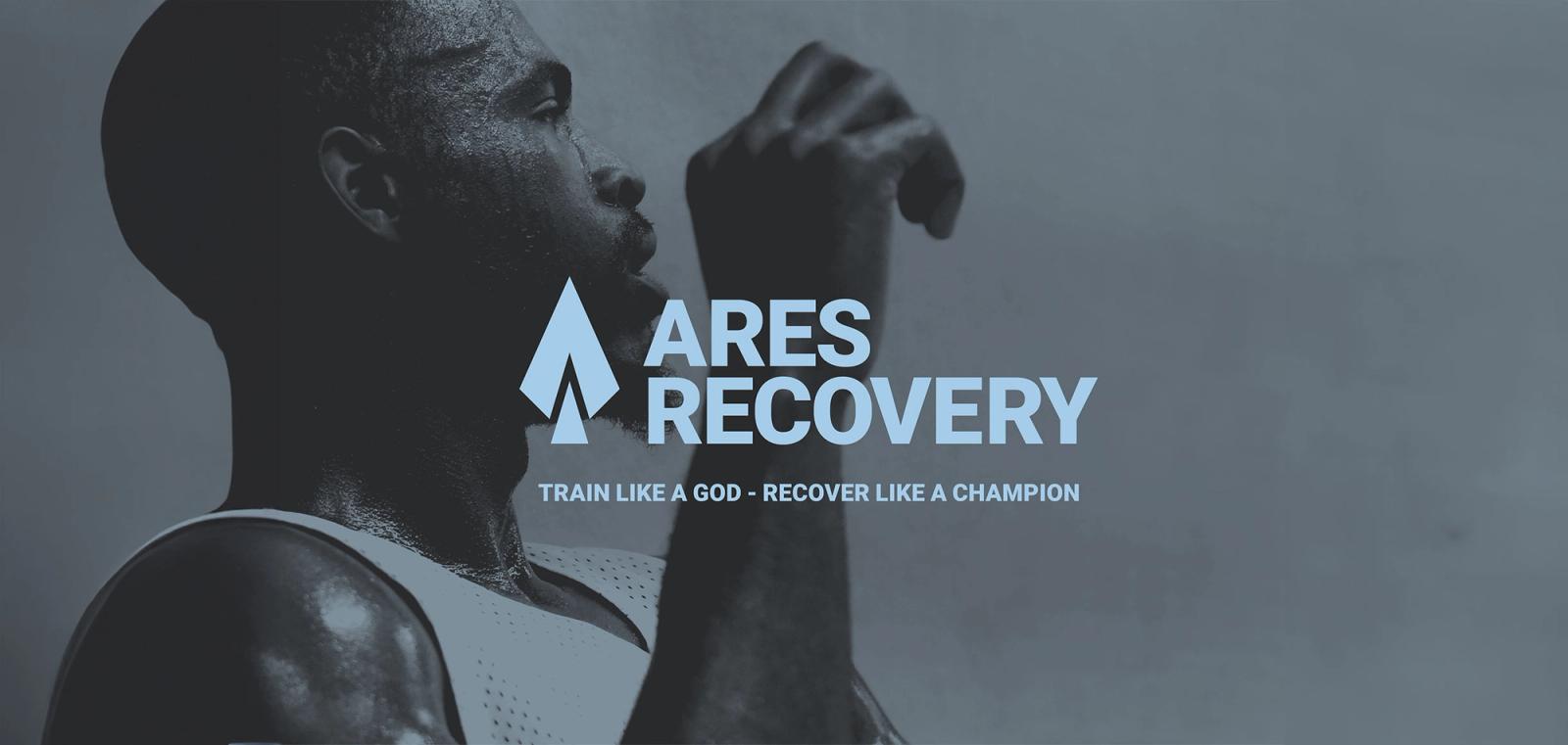
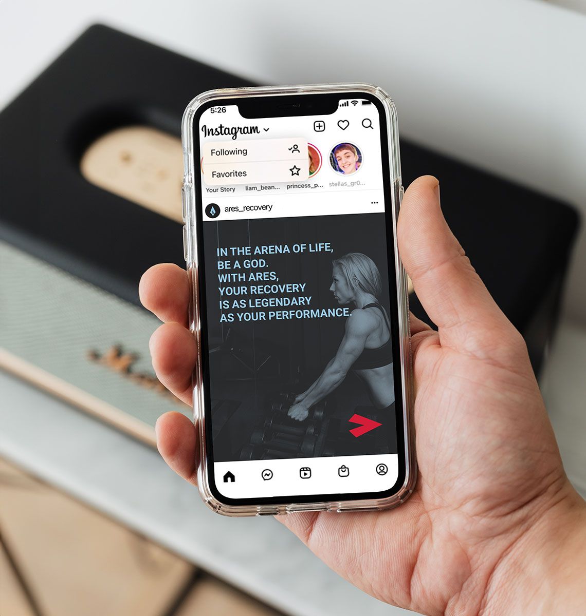
For Ares Recovery, I created a dynamic brand strategy to enhance their position in the red light therapy sector.
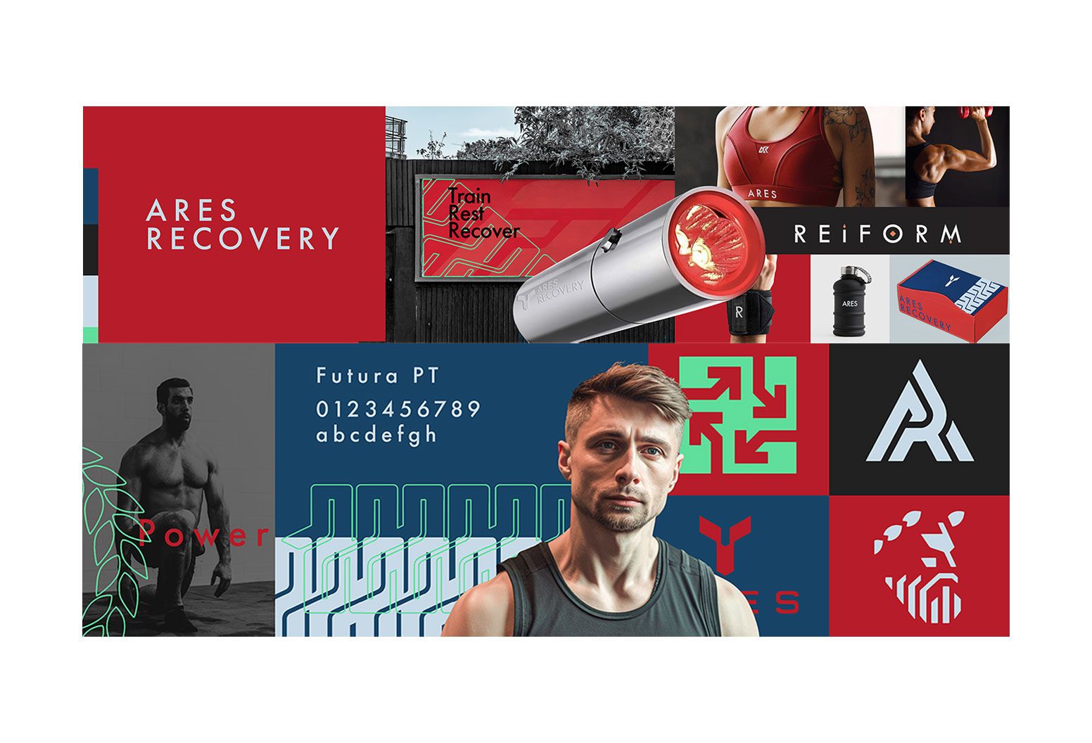
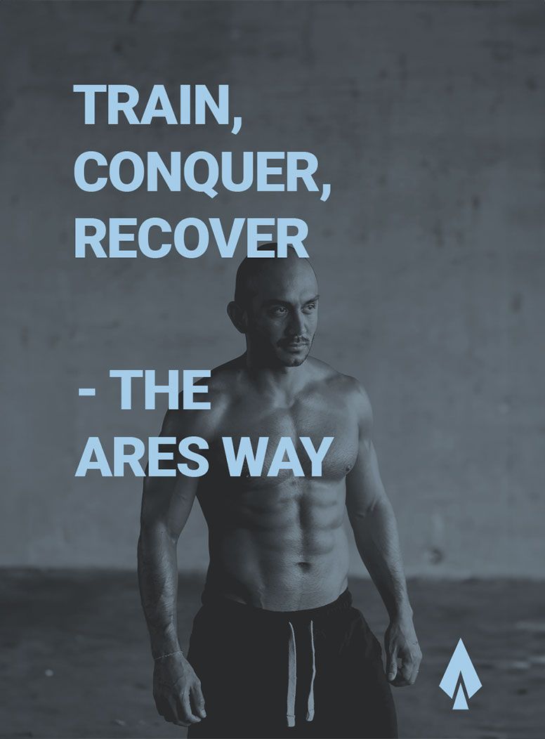
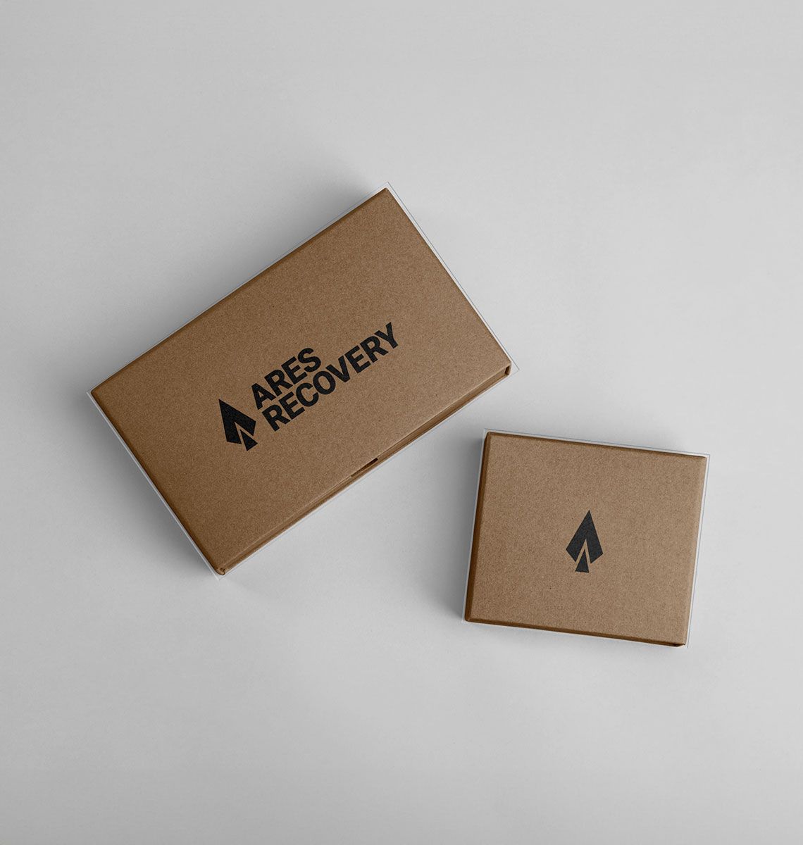
They aim to provide innovative recovery solutions using cutting-edge resources, helping athletes achieve their fitness goals within a supportive community. My work included developing a modern, minimalistic visual identity, crafting compelling messaging, and designing versatile marketing materials that embody Ares Recovery's specialised and professional brand personality. Incorporating elements that drew connections to the Greek god of war, Ares, it emphasised power and strength. The result is a strong, cohesive brand that has created the foundations for increased audience engagement and strengthened brand loyalty.
About the work
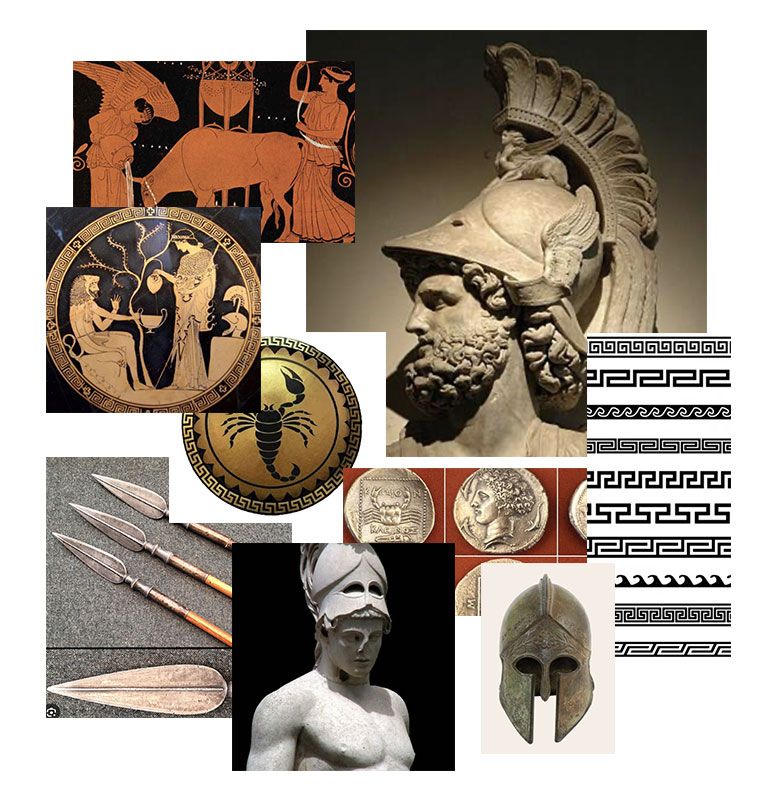
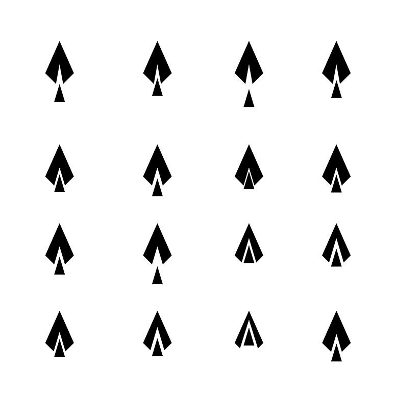
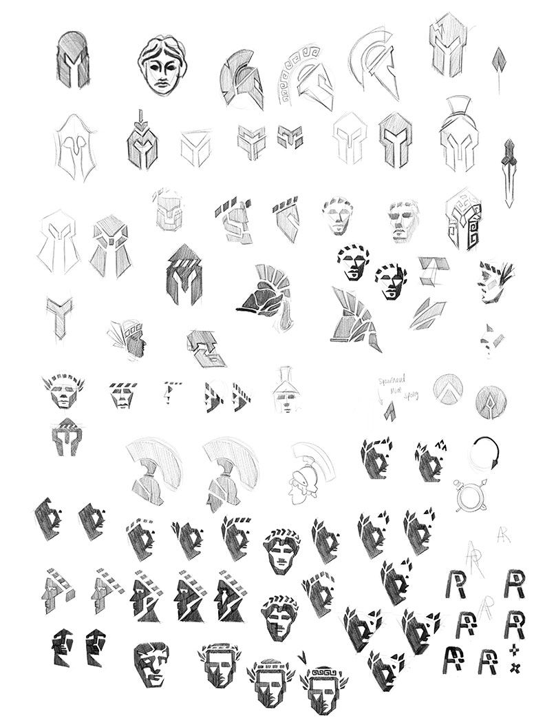
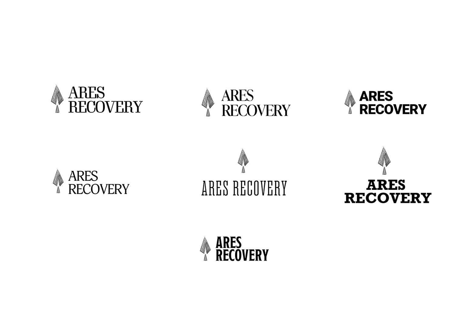
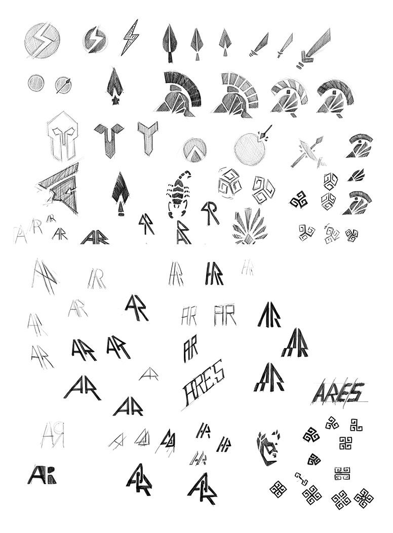
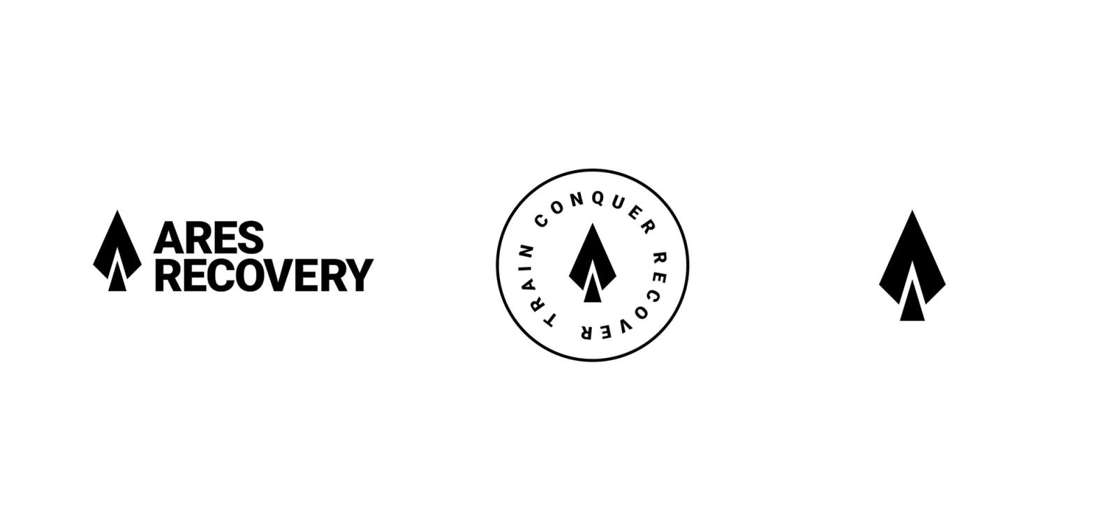
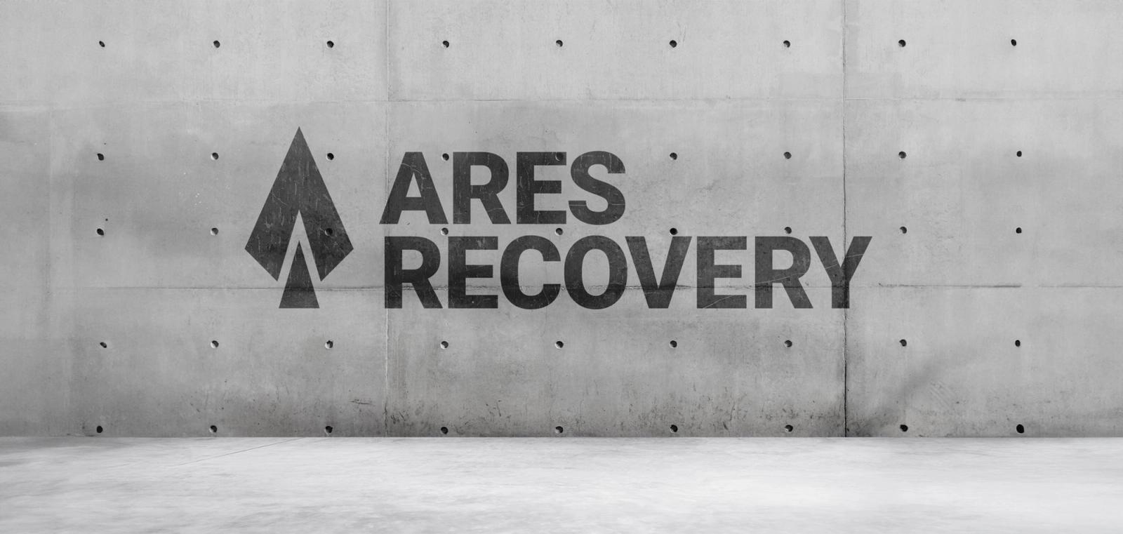
As with any project, this one began with thorough research. I delved into Greek mythology and history, examining ancient ceramics, patterns, statues, imagery, coins, and armoury. In exploring various options, I found that the spearhead shape not only represented Ares, the God of War (often depicted holding a spear) and a primary weapon of the ancient Greeks, but also symbolised progress—like an arrow cutting through the atmosphere, unstoppable. This bold and simple mark was instantly recognisable as Ares.
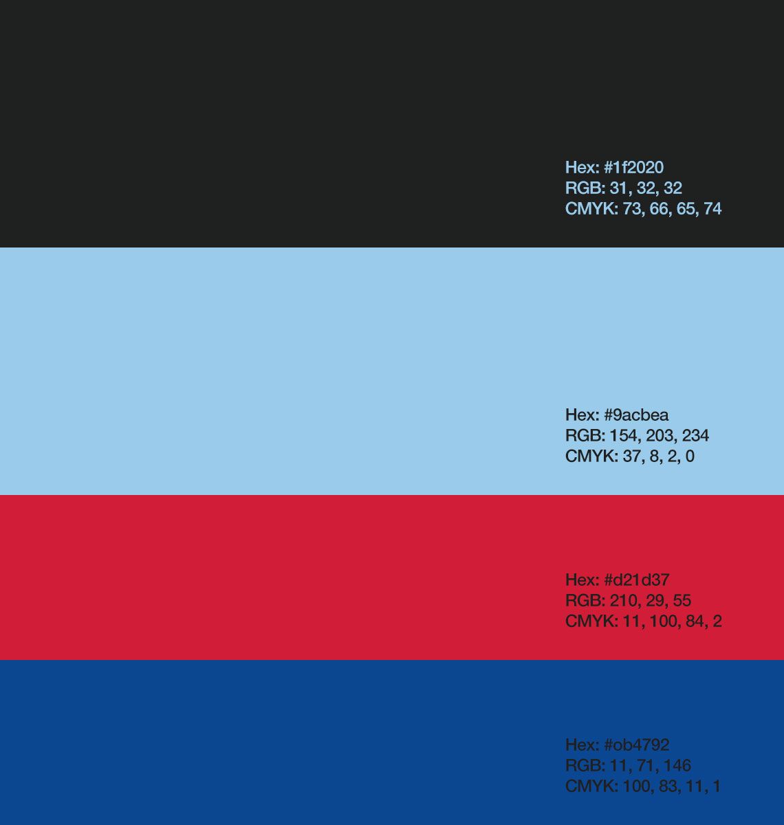
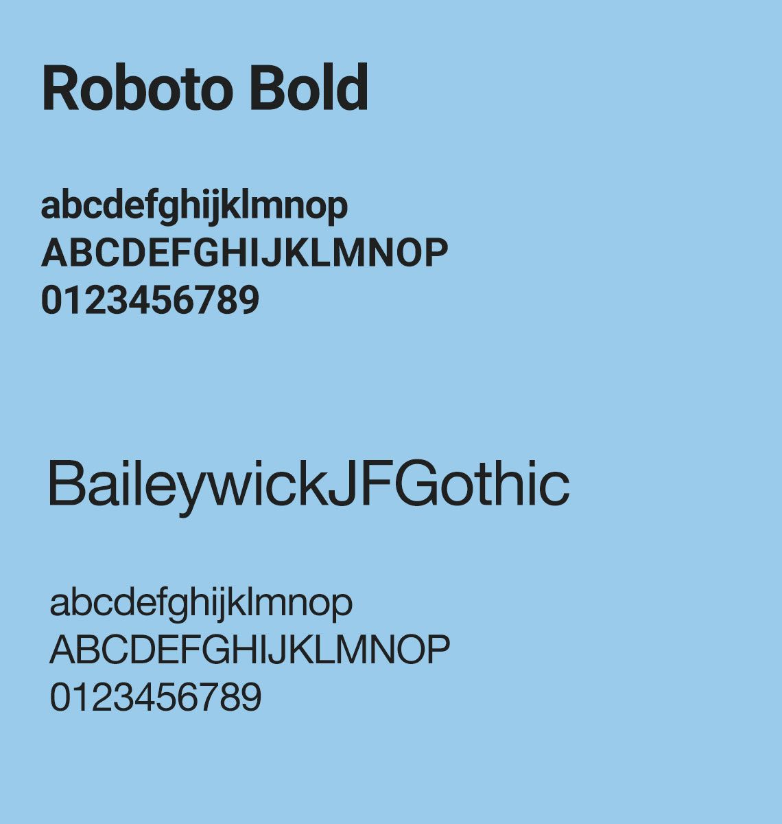


For the colour selection, I aimed to resonate with the fitness and sports side of the brand, taking the opportunity to be bold.
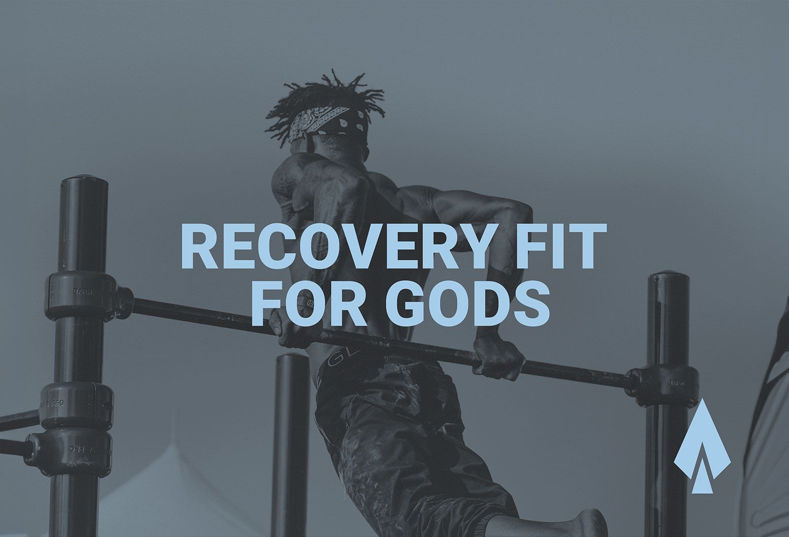

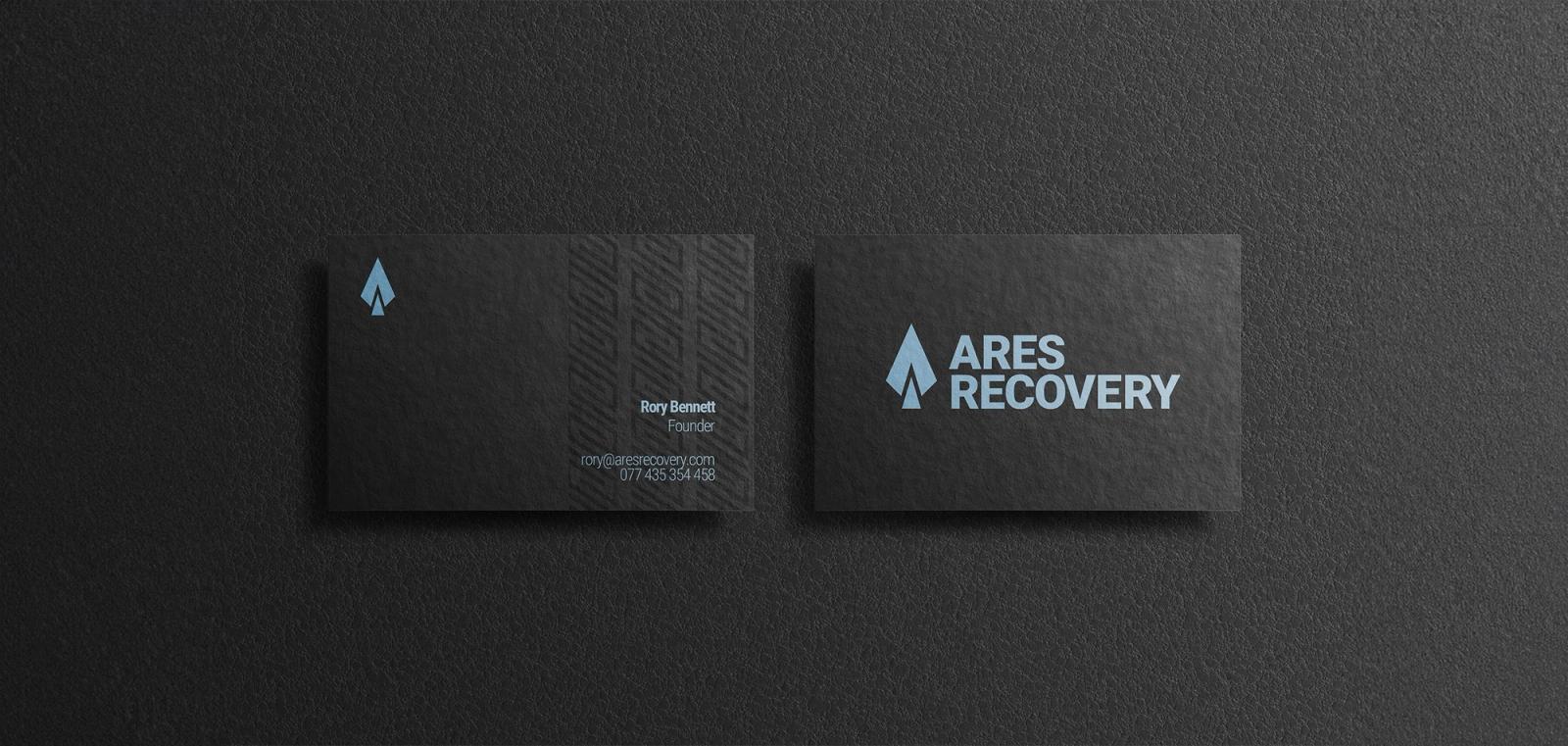
Colour & type choices
The red and blue hues deliver on this, bringing a youthful and energetic feel. This vibrancy is balanced with the sophisticated and professional pairing of charcoal and heavenly blue. The typeface needed to be strong and align with the energetic feel, while maintaining legibility as a priority. Both chosen typefaces achieve this, maintaining sophistication while introducing a sporty element.
How does your brand score?
Two minutes. How your brand earns trust, how your business keeps it, and whether customers and AI can find you.

“The quiz was an eye-opener. It really highlighted the gaps in my business.”