Neeko
| What we did | Logo Design |
|---|---|
| Discipline | Branding |
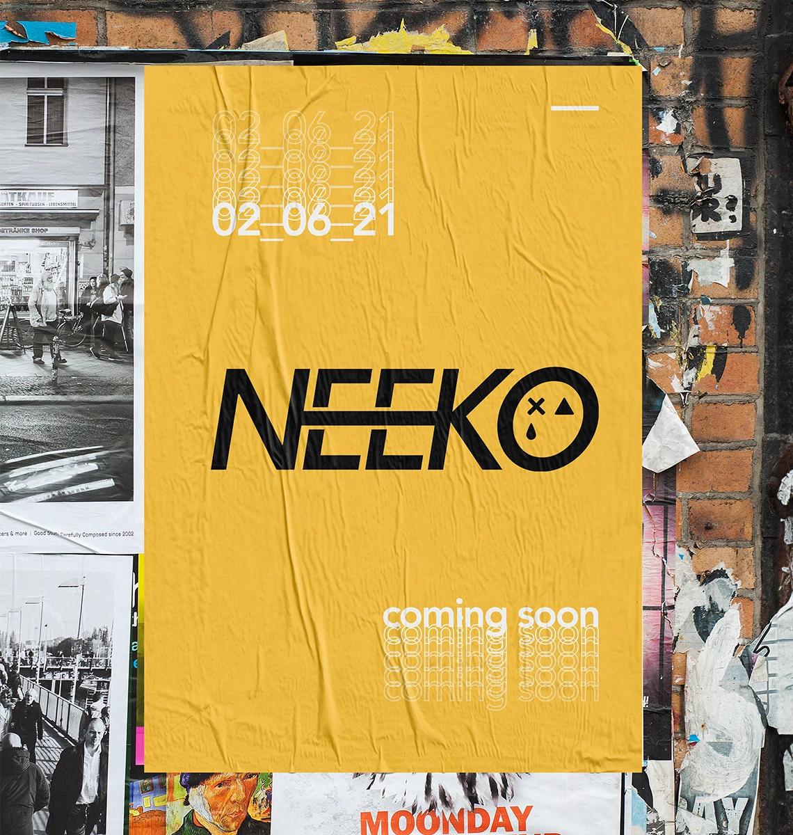
Neeko, a national DJ with residency in some of the top clubs in the city and extensive festival stage experience, wanted to refresh his visual identity as he continued to grow and evolve as an artist.
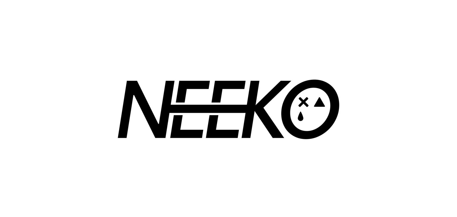
He approached me with a clear vision for a new visual mark that would represent his brand moving forward. This project involved translating his vision into a distinct and impactful identity that could be used consistently across various platforms.
About the work
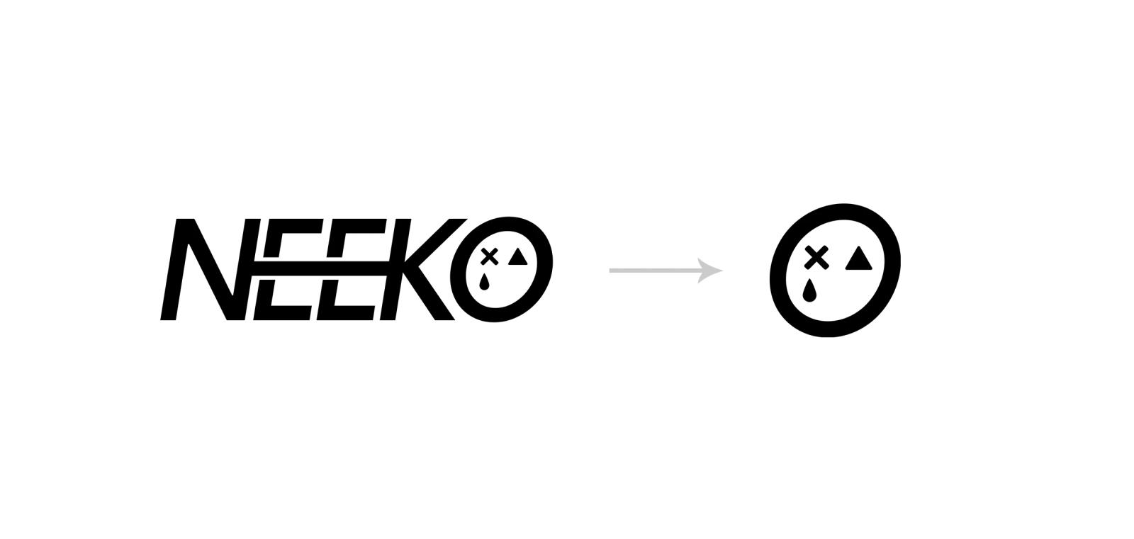
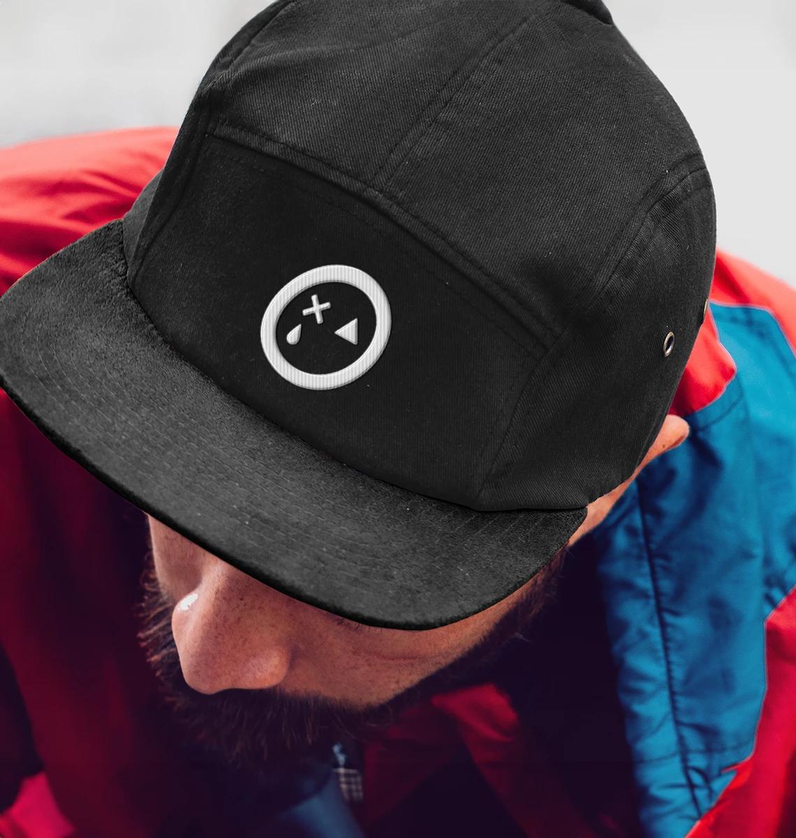
The key to this project was creating a mark that could stand alone as a recognisable icon and also be incorporated into the wordmark. This was achieved by integrating the mark within the "o" letter, maintaining elements from Neeko's previous visual identity. The vision was to design a simple and clean logo that would stand the test of time, avoiding trends and overly whacky designs that might eventually appear unprofessional, a common pitfall in the industry. This approach ensured a timeless and professional visual identity for Neeko.
How does your brand score?
Two minutes. How your brand earns trust, how your business keeps it, and whether customers and AI can find you.

“The quiz was an eye-opener. It really highlighted the gaps in my business.”