Sushi Zen
| What we did | Logo Design |
|---|---|
| Discipline | Branding |
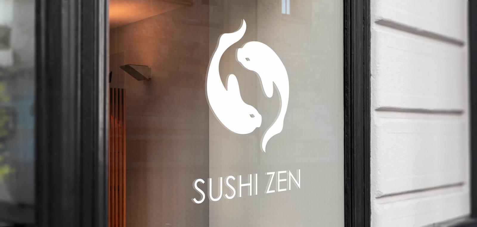
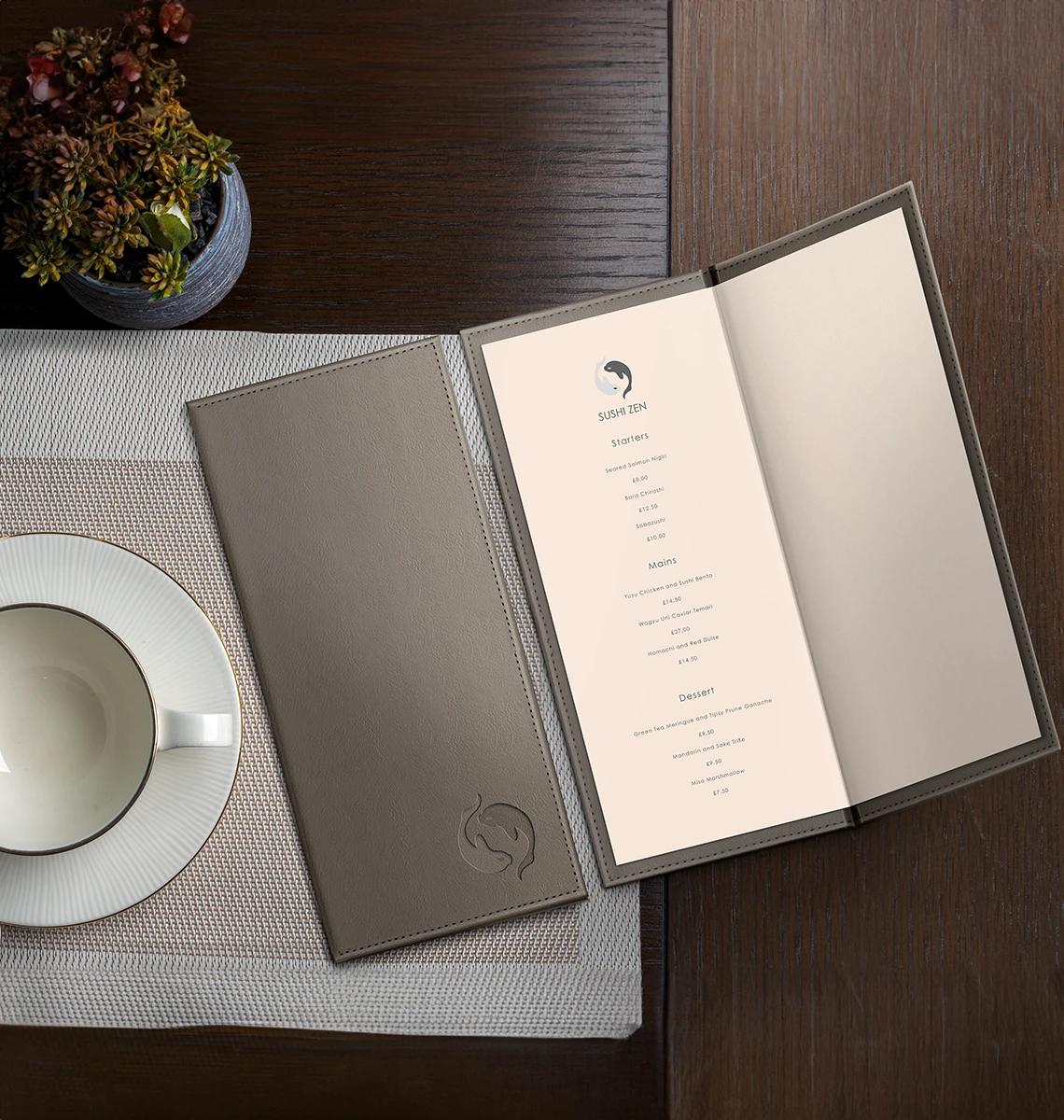
Sushi Zen is a sushi restaurant that aspires to blend traditional Japanese cooking with a modern, sophisticated twist.

They required a logo that would capture this unique aesthetic and be a source of pride for the restaurant. The goal was to develop a logo that reflects their commitment to authentic Japanese cuisine while embracing contemporary elegance, ensuring a memorable brand presence for their customers.
About the work
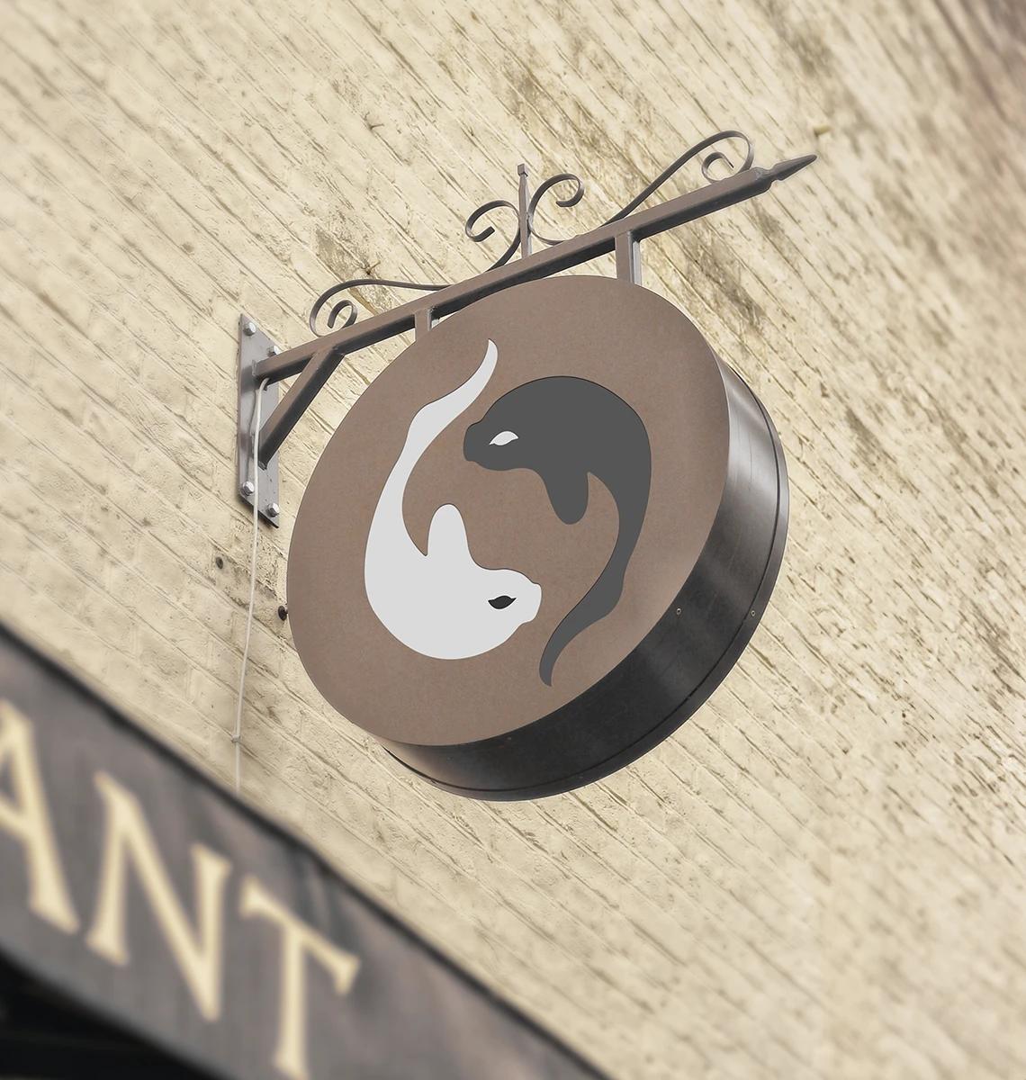
The basis of the logo was inspired by the yin and yang symbol, a staple in Japanese culture that represents balance and harmony, reflecting authentic Japanese methods. To highlight the key component of fish in sushi, I integrated a koi carp, another traditional Japanese symbol. This combination provided a sophisticated and tranquil feel to the logo, perfectly encapsulating the essence of Sushi Zen and its commitment to blending tradition with modernity.


How does your brand score?
Two minutes. How your brand earns trust, how your business keeps it, and whether customers and AI can find you.

“The quiz was an eye-opener. It really highlighted the gaps in my business.”