Stag N' Hens
| What we did | Logo Design, Visual Identity, Naming, Marketing Strategy |
|---|---|
| Discipline | Branding |
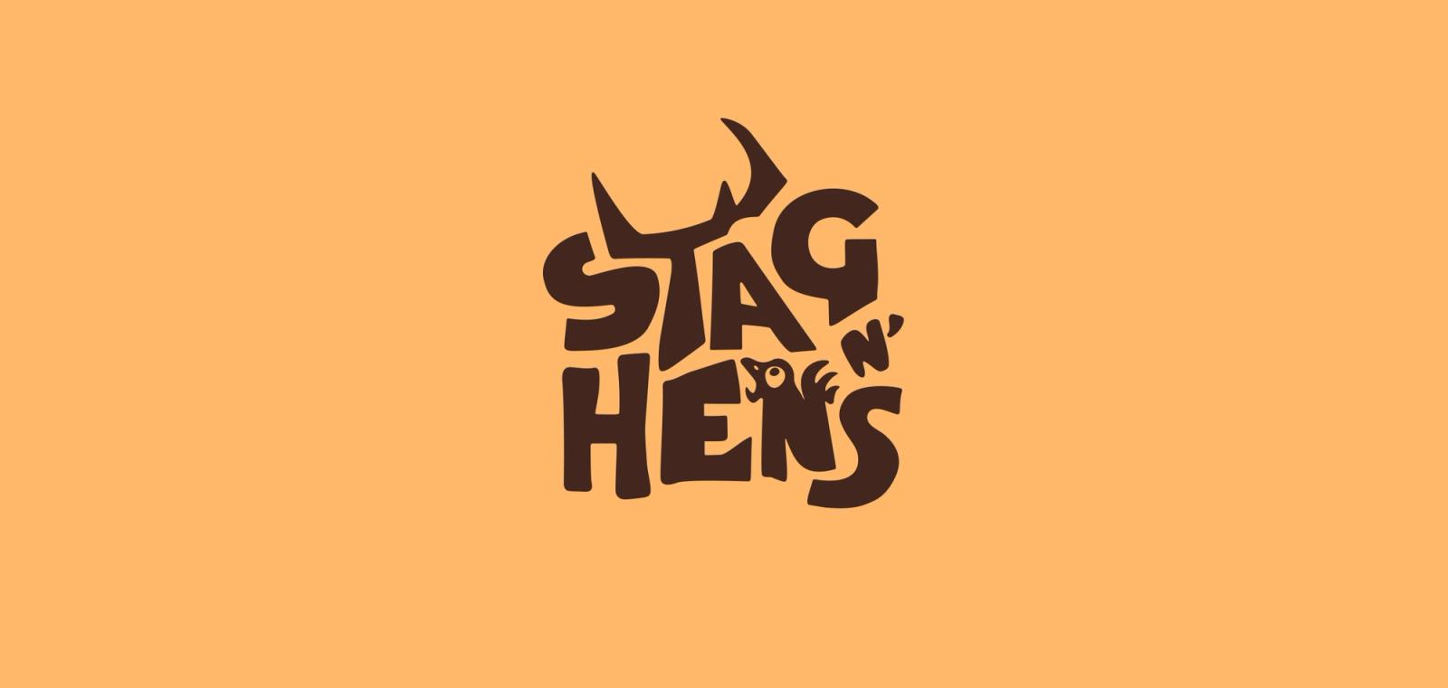
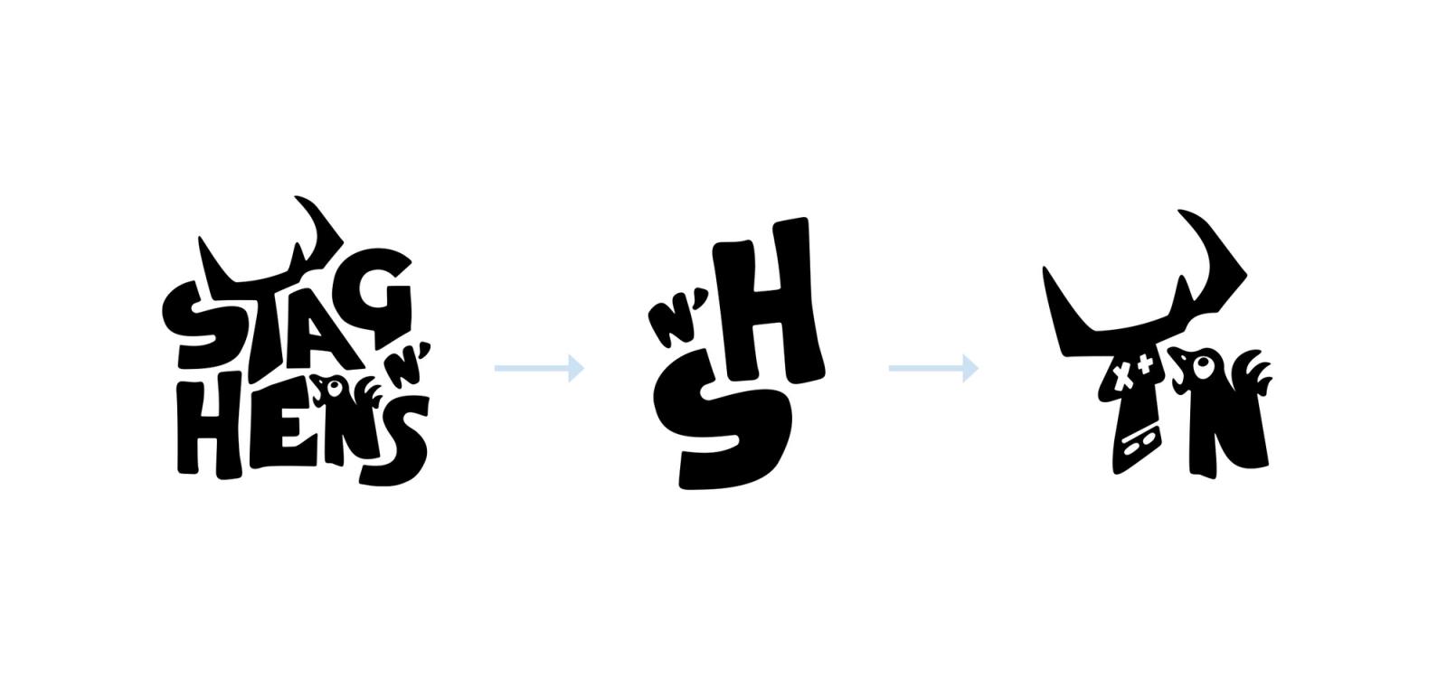
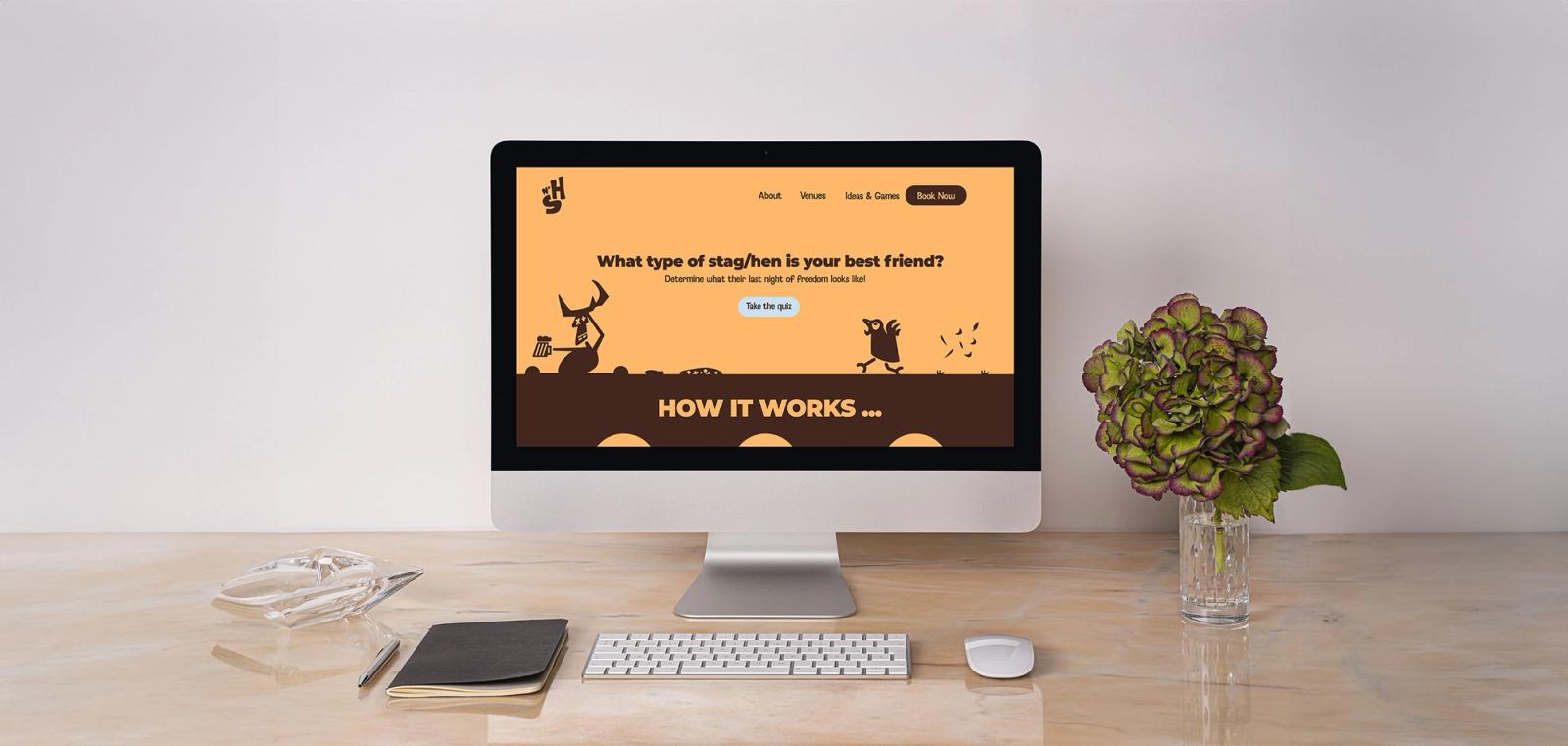
Stag n' Hens, a Cardiff-based organiser of stag and hen parties, sought a playful, tongue-in-cheek visual system to launch their brand.
They specialise in booking tailored bar crawls for unforgettable last nights of freedom. My task was to create a vibrant and engaging brand identity that captures the fun and excitement of their unique offerings.
About the work
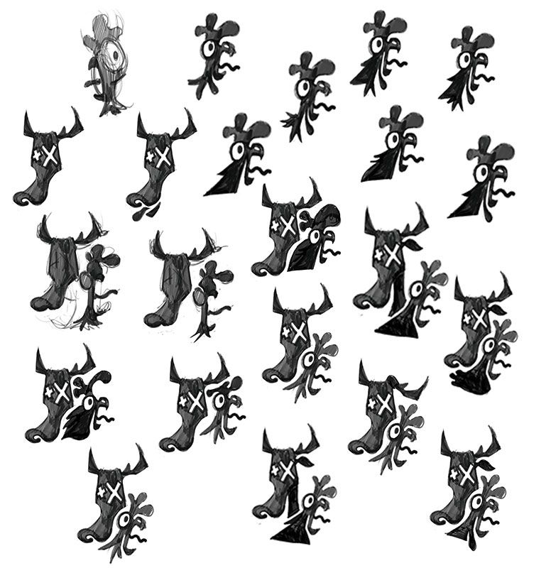
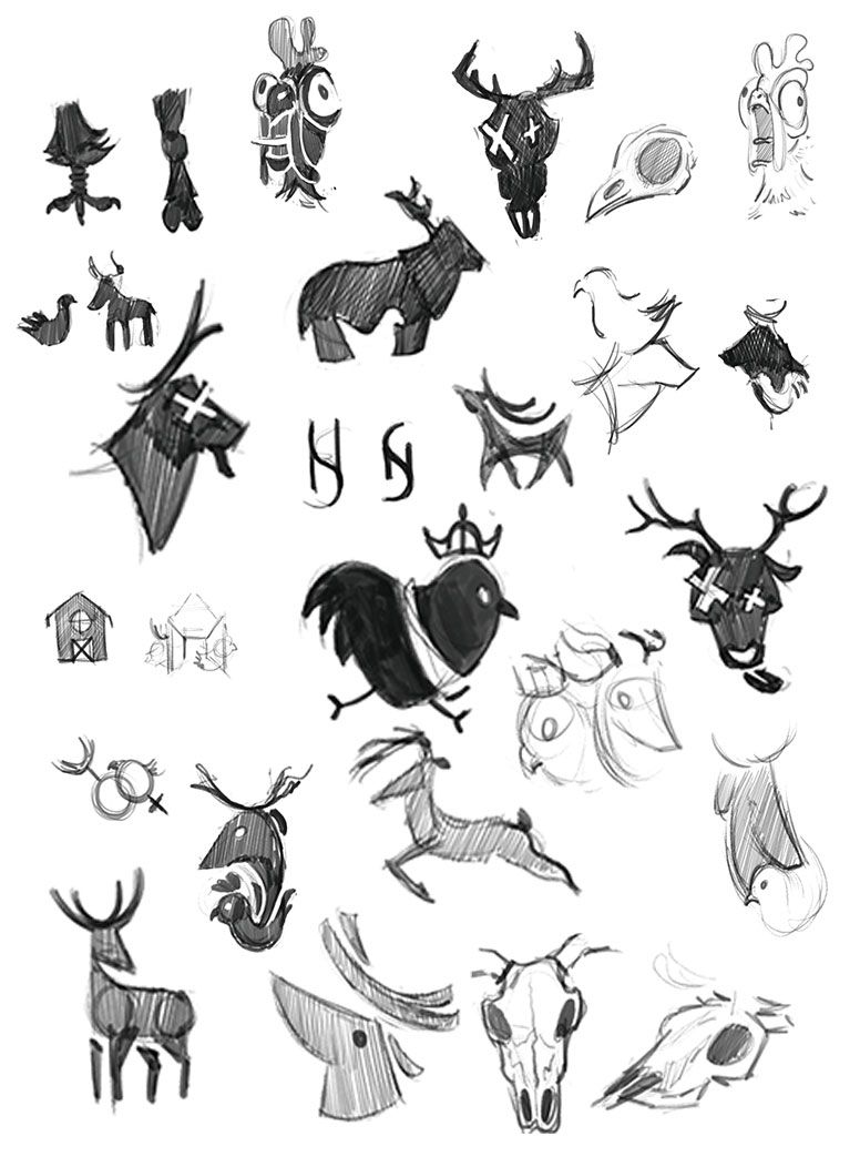
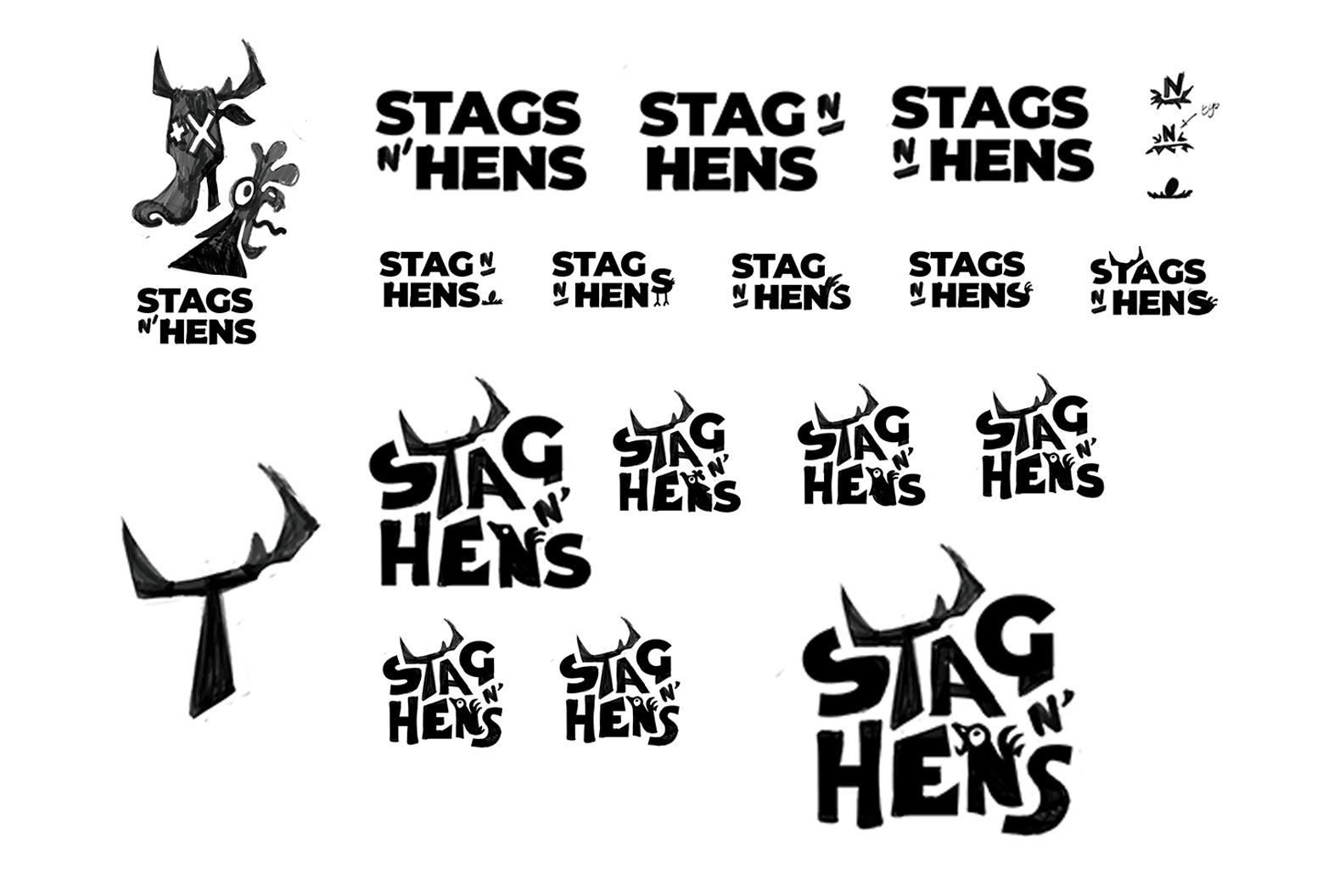
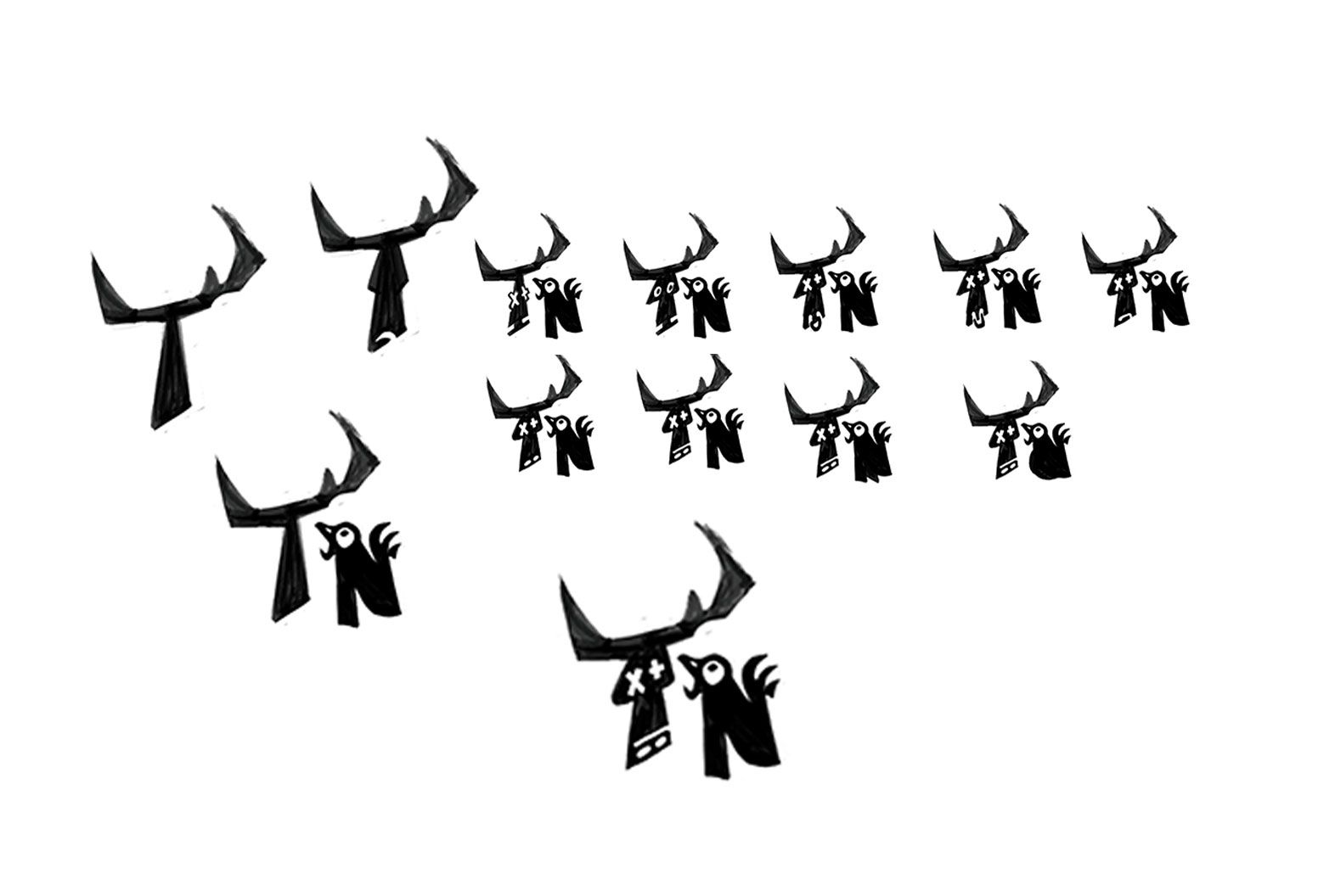
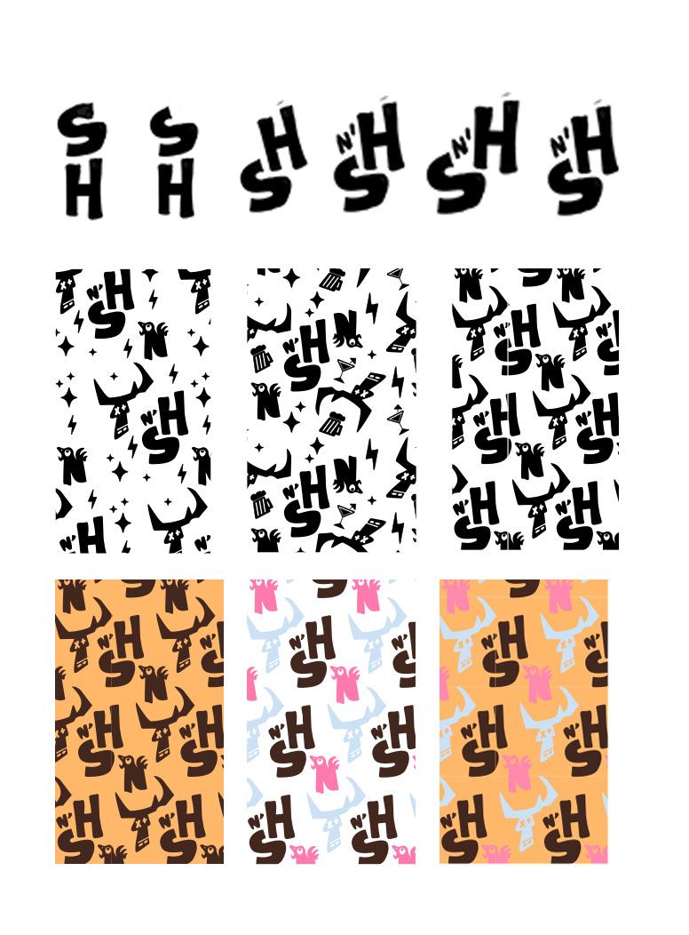
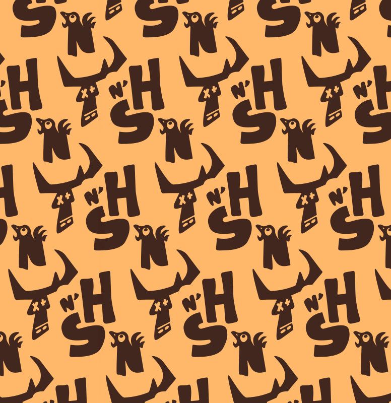
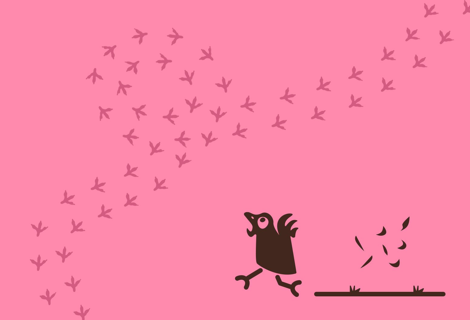
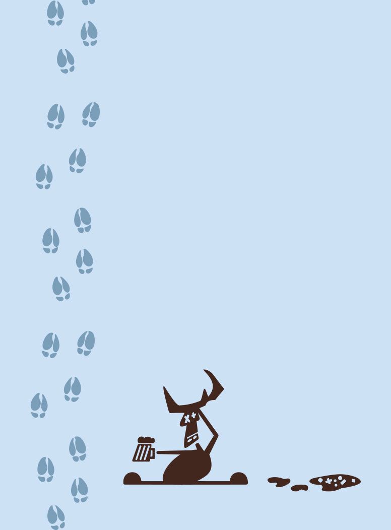
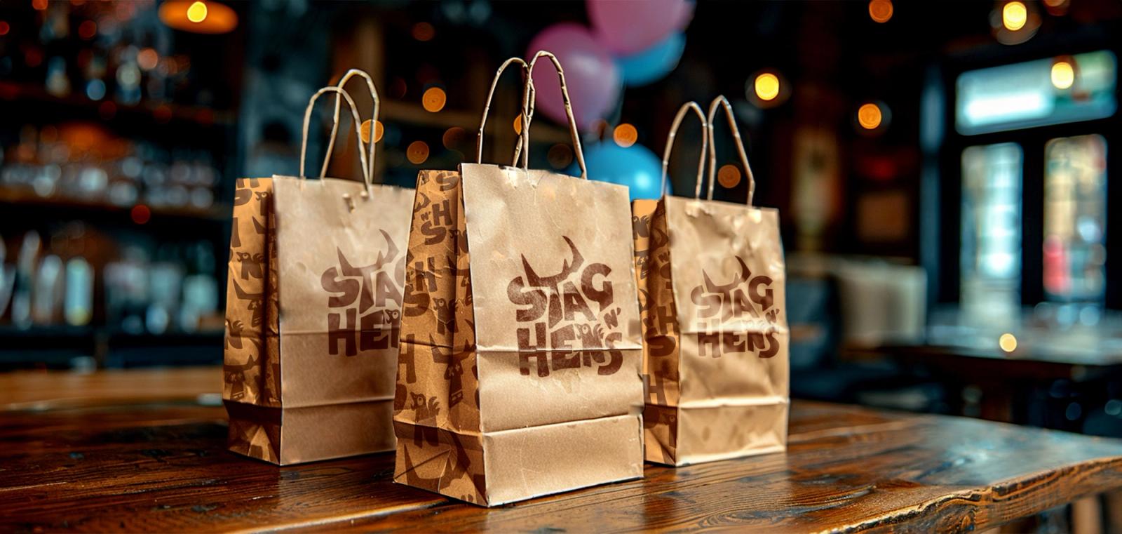
Starting with extensive research, I explored various ways to cohesively represent both the male and female sides of the party. I stumbled upon a visual representation of a drunk stag and a wild hen, but together they felt slightly too complex. Therefore, I opted for a wordmark approach, subtly incorporating playful character elements into the logo. I envisioned the characters playing a vital role in the broader brand identity, serving as illustrations for marketing materials or forming part of a brand pattern. Throughout this process, I considered a whimsical motif: farm animals indulging in drinks, creating a playful and humorous theme for the brand. This approach allowed me to maintain the fun and tongue-in-cheek essence while ensuring a cohesive and recognisable visual identity.
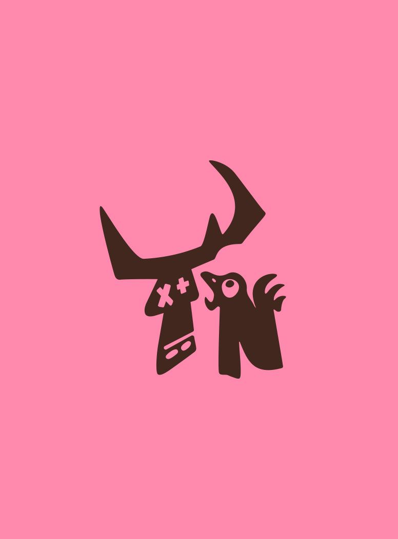
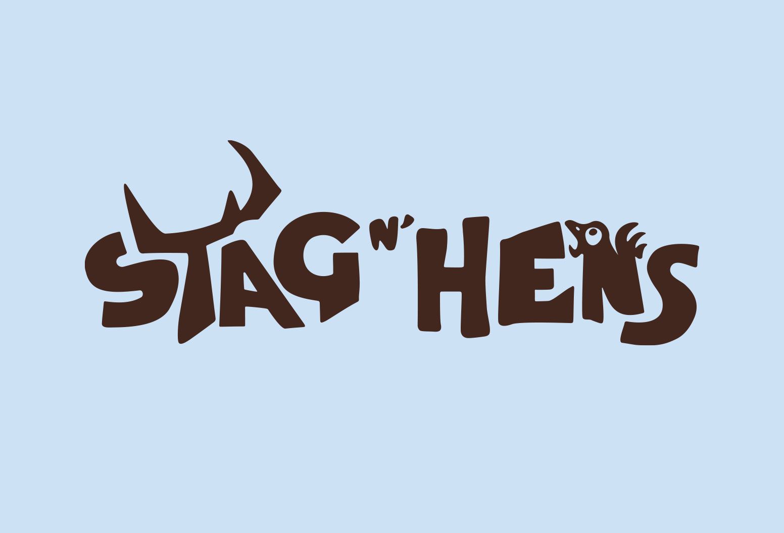
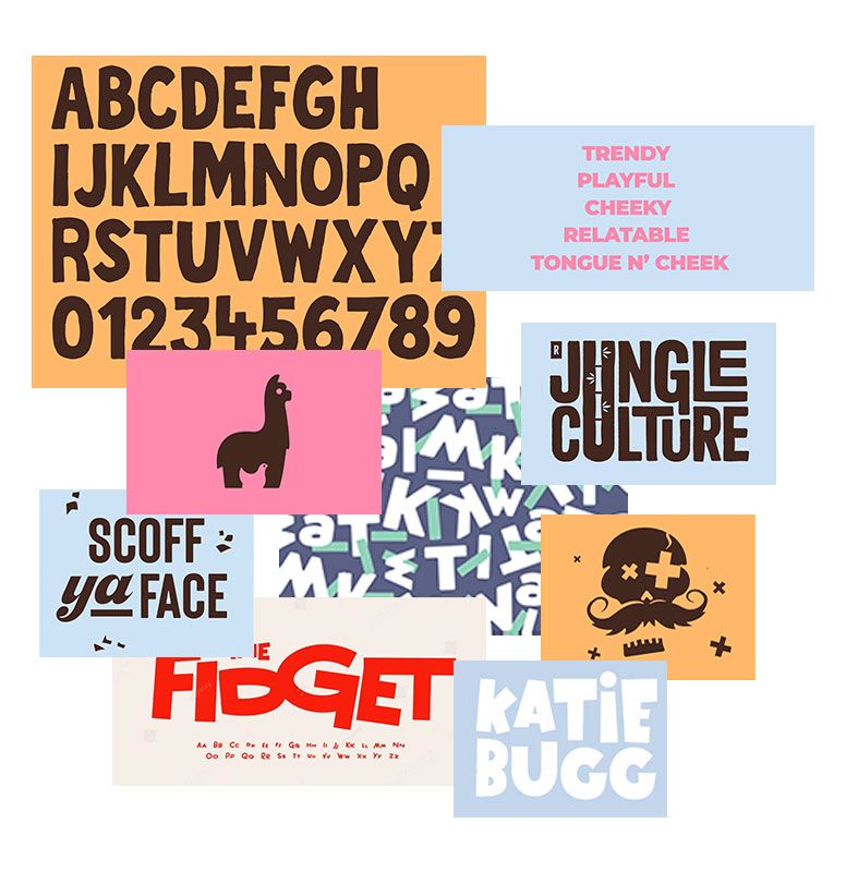
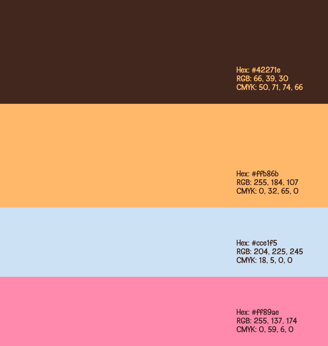
Playing on the farm motif theme, which formed the basis of the brand, I selected a range of browns and muted oranges.
Colour & type choices
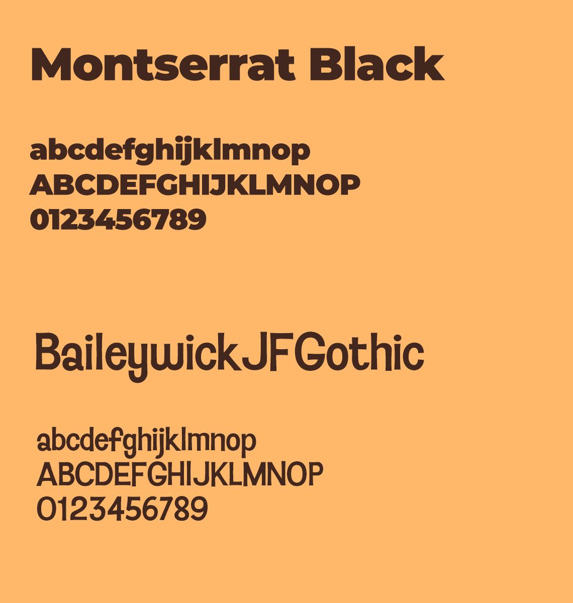
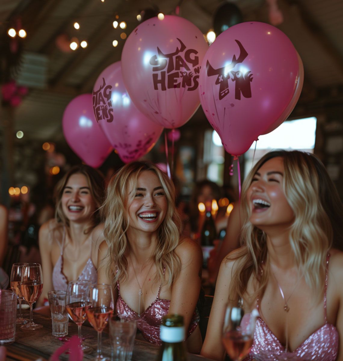
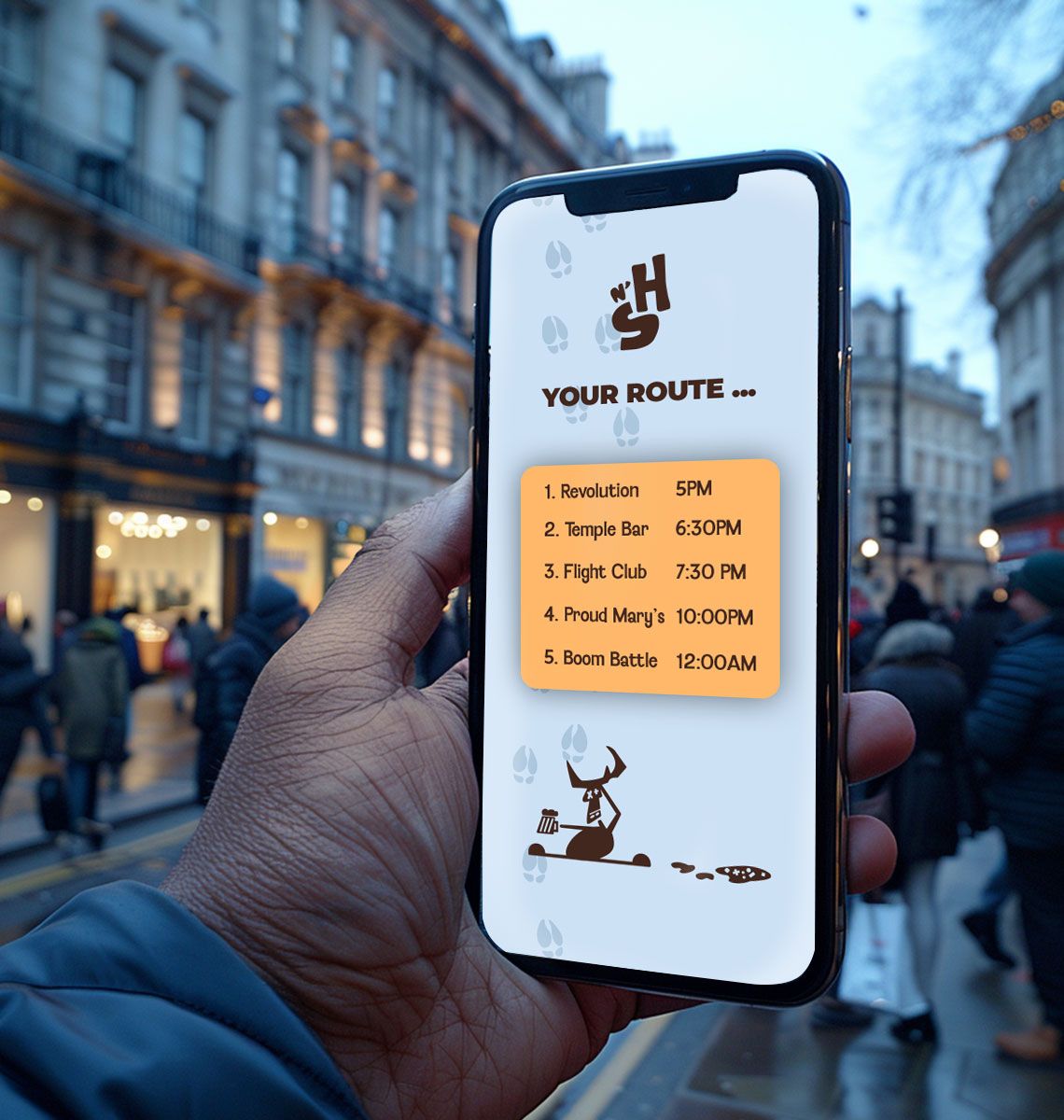
To distinguish the male and female parties, I chose the right shades of pink and blue to accent the brand and make it pop. The typography pairing had to align with the playful nature while maintaining legibility. For headings, I opted for a bold and straightforward typeface, providing a nice contrast to the more whimsical, playful typeface used for body copy. The body typeface, with its simple round forms, ensured readability. Typically, I would use the funkier font for headings, but I felt this brand needed a constant reminder of fun and laughter, which the playful body typeface delivered.
How does your brand score?
Two minutes. How your brand earns trust, how your business keeps it, and whether customers and AI can find you.

“The quiz was an eye-opener. It really highlighted the gaps in my business.”